Article
What Actually Drives SaaS Activation (It's Not More Features)
What Actually Drives SaaS Activation (It's Not More Features)
Most SaaS products add features when they should be removing them. Here's what actually drives activation, retention, and growth from a PM who's done it.
Table of contents
What Actually Drives SaaS Activation (It’s Not More Features)
A few weeks ago I watched a conversation between David Senra and Jason Fried, co-founder of 37signals, the company behind Basecamp and HEY, that stopped me mid-scroll.
Not because it had a new framework or a flashy stat. But because Fried kept saying things I’d lived through as a PM and never quite had the words for.
The full conversation is here: Jason Fried: Your Only Competition Is Your Costs. If you build products, watch it. The whole thing.
But one idea hit me harder than the rest: software slides downhill. It gets better for a while, then complexity creeps in, and suddenly you have a product packed with things nobody uses.
That’s not a design failure. That’s a product strategy failure. And it’s the silent killer of SaaS activation.
Why SaaS Products Keep Getting Harder to Use
There’s no physical resistance in software. No weight, no heat, no breakage. So teams keep adding until the product becomes something nobody asked for.
Fried describes it as a kind of natural gravity. Unlike a physical object, where bad design is obvious, a mug that burns your hand, a handle that doesn’t fit, software can be anything. And because nothing pushes back, it just expands forever.
I’ve watched this happen firsthand. A feature added for one customer segment. Then another. Then another. Before long, the onboarding flow takes 12 steps and new users quit before they see any value.
That’s not a UX tweak problem. It’s a “we kept building without asking what to remove” problem.
The Real Job of Activation
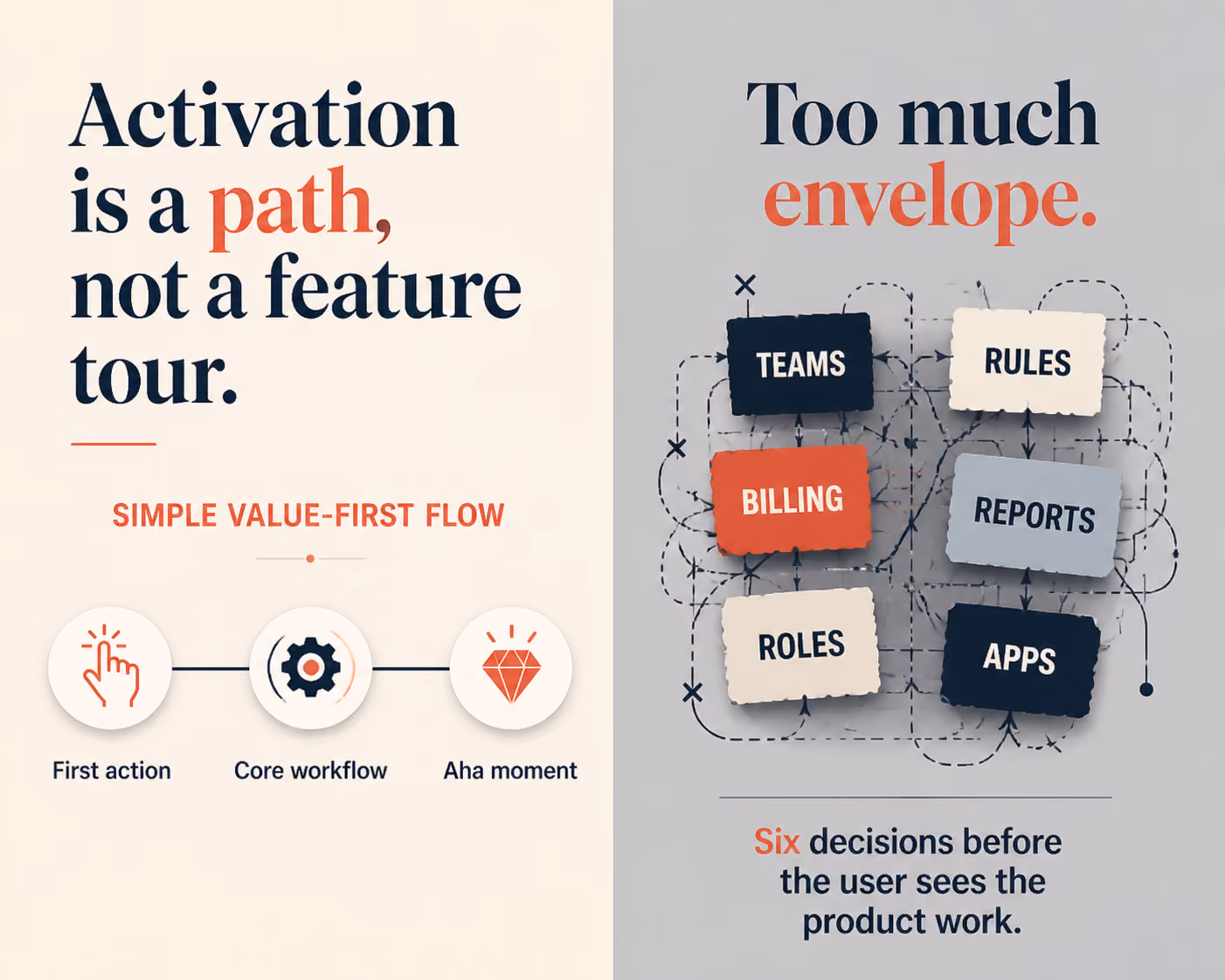
Activation isn’t about showing users everything your product can do. It’s about getting them to the one moment where they go: “Oh, this actually works for me.”
That moment is fragile. Every extra step, every confusing label, every option that doesn’t apply to them, each one chips away at the chance they reach it.
When I worked on onboarding improvements at Apploye, the instinct was always to add more context. More tooltips. More modals. More guided steps. We thought we were helping.
But the real wins came from removing things. Fewer decisions upfront. A clearer first action. A faster path to the one thing that made the product click.
Less friction got more people activated. Not more guidance.
From 12 steps to 4: a concrete example
Here is what that looked like in practice. The original Apploye setup asked a new admin to do almost everything before they saw a single useful screen: create an organization, invite the team, configure projects, set pay rates, choose tracking settings, and more. Roughly twelve steps before the product did anything for them.
We rebuilt the path around one question: what is the smallest sequence that gets a new user to their first tracked activity? Everything that did not serve that moment got pushed to later, made optional, or given a sensible default. The setup dropped from twelve steps to four.
The result was not subtle. A meaningfully larger share of new accounts reached that first activation moment, and they reached it faster - often in the first session instead of the second or third visit. We did not add a single feature to get there. We removed the things standing between the user and the value.
This is also why activation work starts before the UI. If you scope a product around one user and one workflow, the activation path almost designs itself. I broke that scoping process down in how to define MVP scope for a B2B SaaS product - the same discipline that keeps an MVP focused keeps activation focused.
What “Thin” Really Means in Product Design
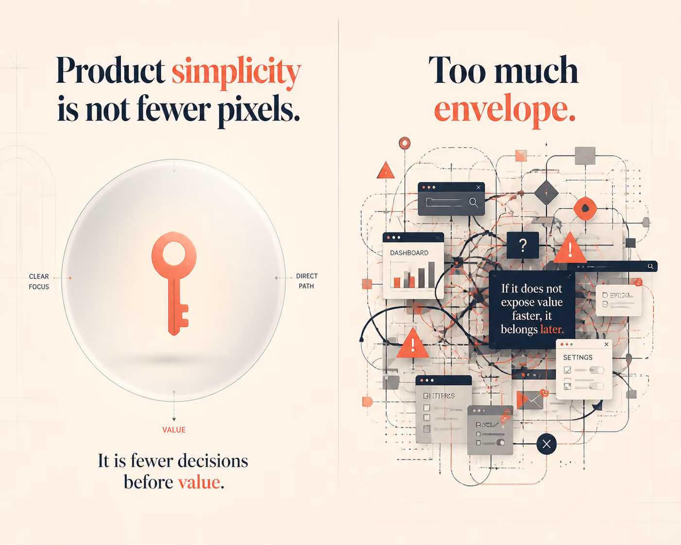
Fried has this concept I keep coming back to: the envelope vs. the letter.
The letter is the product, the actual value you’re delivering. The envelope is everything that wraps around it. His view is that the envelope should be as thin as possible so the letter can do its job.
I apply this directly to product decisions. The interface is the envelope. The core workflow is the letter.
Every time I’m reviewing a feature, I ask: is this envelope or letter? Is this helping users get to value faster, or is it wrapping around the value in a way that slows them down?
Most of what we’re tempted to build is envelope. Most of what actually drives retention is letter.
Activation vs. Retention: Two Different Jobs
It is easy to blur these two together, but they fail for different reasons and need different fixes.
Activation is the first time a user gets real value from your product - the moment the thing they came for actually works for them. It is a one-time event, and it is mostly a function of friction: how many steps, decisions, and dead ends sit between signup and that first win.
Retention is whether they come back and keep getting that value. It is a repeated behavior, and it is mostly a function of habit and fit: does the core workflow slot into how they already work?
The mistake I see most often is teams trying to fix a retention problem by adding features, when the real issue is that users never activated in the first place. You cannot retain someone who never reached value. Fix activation first, then worry about the loop that brings them back.
Two of the fastest ways to find what is blocking activation: watch real sessions to see where users stall - I walk through that in finding UX friction with Microsoft Clarity - and audit your dashboard, because the most common SaaS dashboard UX mistakes quietly bury the one action that matters.
What Actually Retains Users
Retention doesn’t come from having more features than the competition. It comes from users building a habit around the core thing your product does well.
Fried makes this point clearly in the conversation with Senra. The people who use 37signals products, Basecamp and HEY, aren’t the ones who explore every corner of the app. They’re the ones who found a workflow that fits and repeated it every week.
That’s the activation moment you’re actually designing for. Not “user saw the dashboard.” Not “user completed setup.” But: user got value from the thing they came for, and wanted to come back.
This shifts how you prioritize everything. You stop asking, “What can we add?” You start asking, “What’s getting in the way?”
Three Questions I Ask Before Every Feature Decision
These came from building products, not from a playbook:
1. Does this get users to value faster, or does it delay it? If a new feature adds a decision before someone reaches the core workflow, it’s probably hurting activation.
2. Would our most active users notice if this disappeared? If the answer is no, it’s worth asking whether it belongs in the product at all.
3. Are we adding this because users need it, or because we want to ship something? Honest answer required. There’s no shame in not shipping.
The product that wins long-term is usually the one that was ruthless about what it cut, not what it added.
How to Find What to Remove
Removing the right things is harder than adding, because every feature has someone who asked for it. A few signals I trust:
- Usage data. If a step or feature sits unused by your most active accounts, it is a candidate for removal - or at least for moving out of the critical path.
- Support tickets. Repeated confusion about the same screen is rarely a documentation problem; it is a design problem. Support is the cheapest activation research you have, which is part of why customer support is one of the best growth levers in SaaS.
- Session recordings. Watching ten new users attempt setup will teach you more than a quarter of survey responses.
The pattern is always the same: the data tells you what to cut, and cutting is what lifts activation.
FAQ
What is SaaS activation and why does it matter?
Activation is the moment a new user first gets real value from your product. It is the tipping point between someone who tries your app and someone who becomes a regular user. If activation is low, no amount of marketing spend will fix your retention problem.
How does simplicity improve user activation?
Simpler products have fewer barriers between a new user and the core value. When users reach the aha moment quickly, they are far more likely to come back. Complexity creates friction, and friction kills activation.
How do you know when a SaaS product is too complex?
Watch your support tickets. If the same basic questions keep appearing, that is a product clarity problem. Also watch where users drop off during onboarding because that is usually where complexity does the most damage.
Can you remove features without upsetting users?
Yes, if you do it carefully. Start by tracking feature usage. Features that fewer than 5 to 10 percent of active users touch are usually safe to cut or simplify. Most users will not notice, and the ones who stay will have a better experience.
What is the difference between activation and retention?
Activation is the first moment of real value. Retention is whether users come back. Activation drives retention because if users do not activate, they will not retain. Fix activation first.
Build Less. Deliver More.
The products that win aren’t the ones packed with features. They’re the ones that get out of the user’s way.
That’s what I took from watching Fried and Senra’s conversation. And it’s what I’ve seen hold true after 5+ years building B2B SaaS products, from zero-to-one at Apploye to shipping new product lines like Fieldservicely.
If your activation rates are low, don’t reach for the feature backlog first. Audit your existing flows. Find what’s slowing users down. Remove it.
The product still around in five years will be the one that was useful, not the one that was feature-complete.